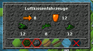
> On 29.06.05 20:53 Jens Granseuer wrote:
>
> > In the unit info dialog, the impassable terrain tiles are shown a bit
> > darkend (bad contrast). A red cross or a red border on these tiles
> > would enhance readability (for beginners).
> >
> > Same applies to the damage indicator dialog, where the damage taken
> > is also shown as darkend tiles.
>
> If you have some spare time and it's enough of an itch why not fire
> up your favourite image editor and try to do an improved mockup?

I have attached an illustration of the UnitInfoWindow. The impassable
terrain (units cannot move on these) has a red border in addition to the
darkend tile display. I think it already looks quite nice. Perhaps you can
simply overlay the active unit cursor, so there's not much work.

CU
Marko
Attachment:
UnitInfo.png
Description: PNG image