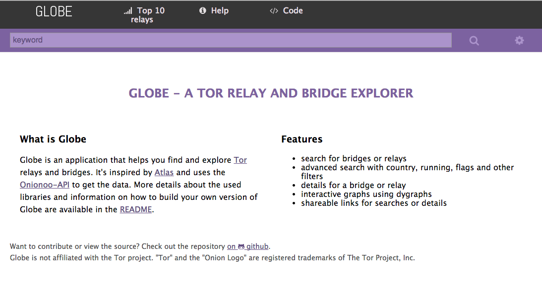
See attached screenshot of it on my device.


On 2013-11-03, at 1:14 PM, me@xxxxxxx wrote:
Hi there,
I worked on a new update for globe. This update addresses some features that were missing or not possible in the current version of globe ( http://globe.rndm.de/ ).
These changes include:
- fixed minification process to allow usage of the ember production build
- removed unnecessary whitespace on top of the page
- modified loading indicator
- added subpages
Because this update includes some major ui changes, I would like to get some feedback on it.
You find the latest version on http://globe.rndm.de/lab/
Cheers,
Christian
_______________________________________________
tor-dev mailing list
tor-dev@xxxxxxxxxxxxxxxxxxxx
https://lists.torproject.org/cgi-bin/mailman/listinfo/tor-dev